
Title: What Am I?
Above is a project we worked on in class involving mass copying, which was needed for the petals. This was when I first saw that this program could do more than I originally thought. 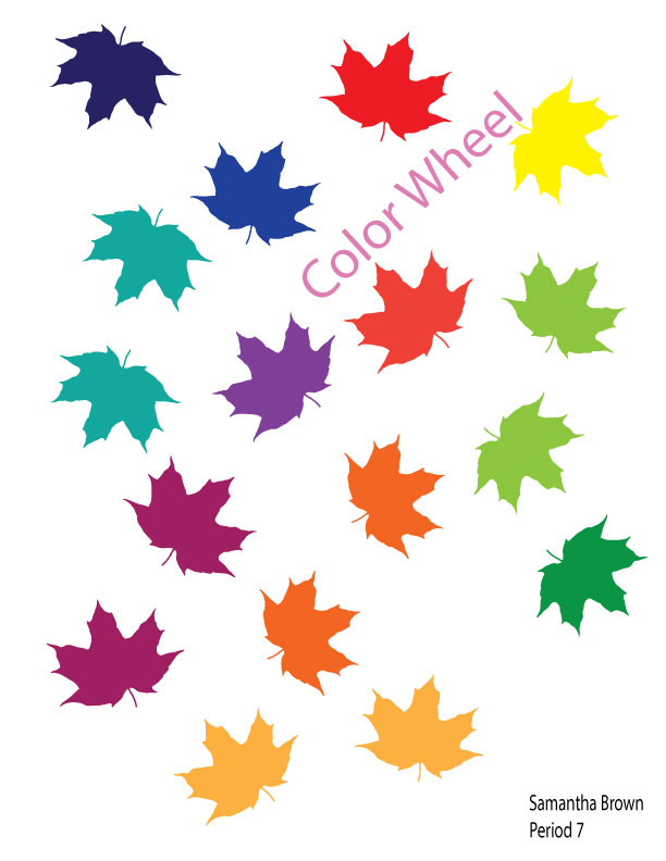
Title: Unique Color Wheel
This project let us use more creativity than the first few, since we could choose what ever shape we wanted to use for our color wheel. I was ready for Autumn weather when we did this, which explains the fact that I decided to use leaves falling, yet still showing all of the colors included on the color wheel. 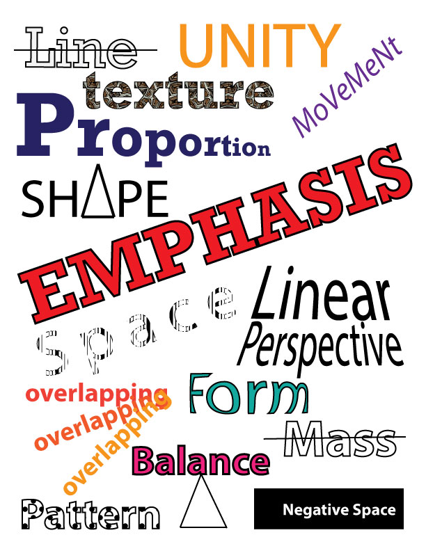
Title: Design Visual Vocabulary
This project was a visual representation of vocabulary of some basic tools and elements in design. It was interesting to do, because there were multiple ways to show the vocabulary via text effects on the words. There was no telling how each person would choose to represent the design vocabulary. 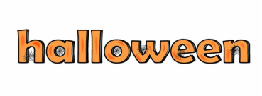
Title: Spooky Halloween Text Effects
In this project, we learned how to create art brushes out of simple shapes as well as creating spider webs for spooky effect. This was one of four projects that were Halloween-themed, which was perfect for me because I am a very festive person. 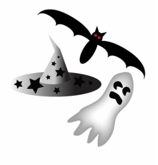
|

Title: Ruler
Above is a ruler created in Adobe Illustrator. This was the first assignment I ever did in Illustrator and it actually took me 3 tries to get it right. 
Title: Color Wheel
Above is my color wheel assignment, demonstrating the knowledge of the relationships between colors in the color wheel. as well as primary, secondary, and tertiary colors. 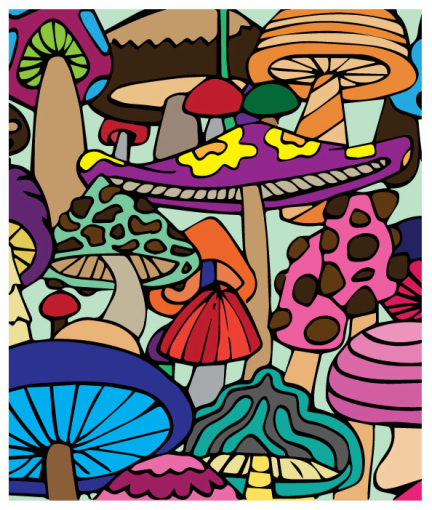
Title: Coloring Page
This assignment taught us how to use the live paint bucket option in Adobe Illustrator, and allowed us to access out inner creativity because we were able to choose our coloring pages and choose whichever colors we wanted. I had a lot of fun with this assignment, and it actually relaxed me. Title: Group Project Popplet Below is the link to my group project that was done via popplet. This project goes over the principles and elements of design. I believe it was the last of the projects that had to do with this unit. 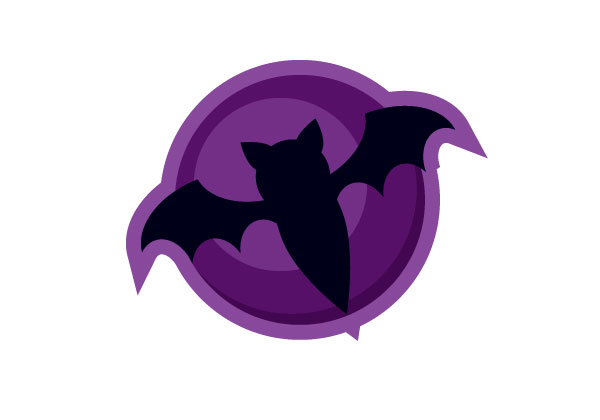
Title: Bat Icon
For this assignment we were given instructions on how to create a bat icon and used the pathfinder panel quite a bit. If I am being honest, this one gave me some difficulties in the process, but i didn't give up and eventually got it done and it looks good. 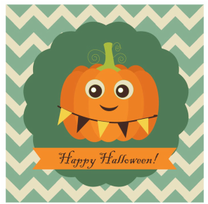
|
|
Title: Halloween Trio
This assignment helped me explore the effects drop down menu, as well as bezier curves and the gradient tool. All while making some cute, festive, and Halloween-related graphics! 
Title: Typography Tips and Tricks
For this assignement, we watched a video describing the tips and tricks that could be used for typography and used those tips to create typography on a word of our choice. Instead of using the default word of "Typography" for this assignment, I used the name of my nephew. I was originally going to edit and use this as a gift for him for Christmas, but I never got around to it, and I didn't have enough experience with Illustrator to make it good enough. 
Title: Shape Typography
I really liked doing this assignment. It was easier than I thought it would be and it let me express my mystical side by having the freedom to chose my shape, text and I decided to add a background that went along with the shape typography, while still expressing a little bit of me in it (my favorite color is purple). It was pretty much a matter of fitting the letters to the shape, and it was cool seeing how close I could get to the edge to make it look its best. 
Title: Vintage Badge
This assignment was during the unit of logo design. For the longest time I could not for the life of me find inspiration for this assignment. It definitely turned out way different than I pictured it would have, expressing, again, my more mystical sign. The CC in the middle is related to the business I would like to eventually open when I graduate college. |
Title: Retro Pumpkin Card
This Project was the last of our Halloween assignments, and I must say the cutest! It is amazing how possible it is to make something like this with some simple shapes, as long as they are put together right. If I had a Halloween party, I would definitely use this in an invitation. 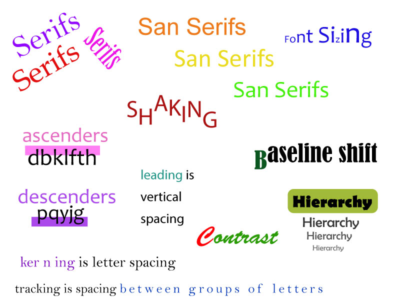
Title: Typography Visual Vocabulary
This assignment was pretty straight forward, like the earlier visual vocabulary assignment for design. The difference is that this one focused on the elements of typography. I changed the placement of the words as much as I could to make it seem less uniform and "placed." 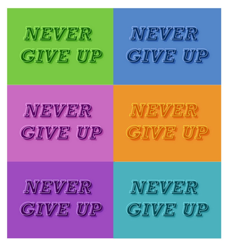
Title: Simple Text Effects
For this assignment I decided not to change the phrase, but I did use different shades of the colors that I liked better. I really liked the look of the shadow as well as three layers of color shading. The whole point was to end with the effect of the letters popping out at the viewer without using 3D lettering. 
Title: Creating a Logo
This assignment, again was difficult for me to find inspiration for and definitely took me more time than I wanted it to. However with the suggestions in the videos provided for us, I was able to come up with many different ideas involving some aspect of my name. This just happened to be the best one out of all. It also drove me to use the shape builder tool for the first time! |
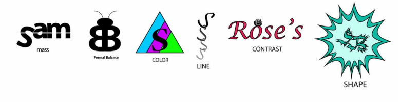
Title: Brand Yourself Logo
This assignment also required the use of my name in each logo. Whether it was my nickname, or just a letter, my middle name, or my initials, each one was mostly a result of me just playing around in Illustrator until I accomplished something that I was okay with. My favorite two are the ones that are labeled "color" and "contrast."
This assignment also required the use of my name in each logo. Whether it was my nickname, or just a letter, my middle name, or my initials, each one was mostly a result of me just playing around in Illustrator until I accomplished something that I was okay with. My favorite two are the ones that are labeled "color" and "contrast."
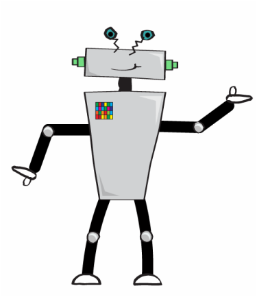
Title: Robot Guy
This assignment introduced me to the idea of creating shine as well as shadow, and definitely used the roughen effect for much of it, and also the blob brush to create the hands. Once again, simple shapes and lines were used to make an entire robot. |

Title: Trendy Design
This assignment took me longer than I wish it would have, but it showed me how to produce 3D text, as well as overlaying symbols on them, and I like how the text turned out a lot, but I definitely think the background could be much better. |
